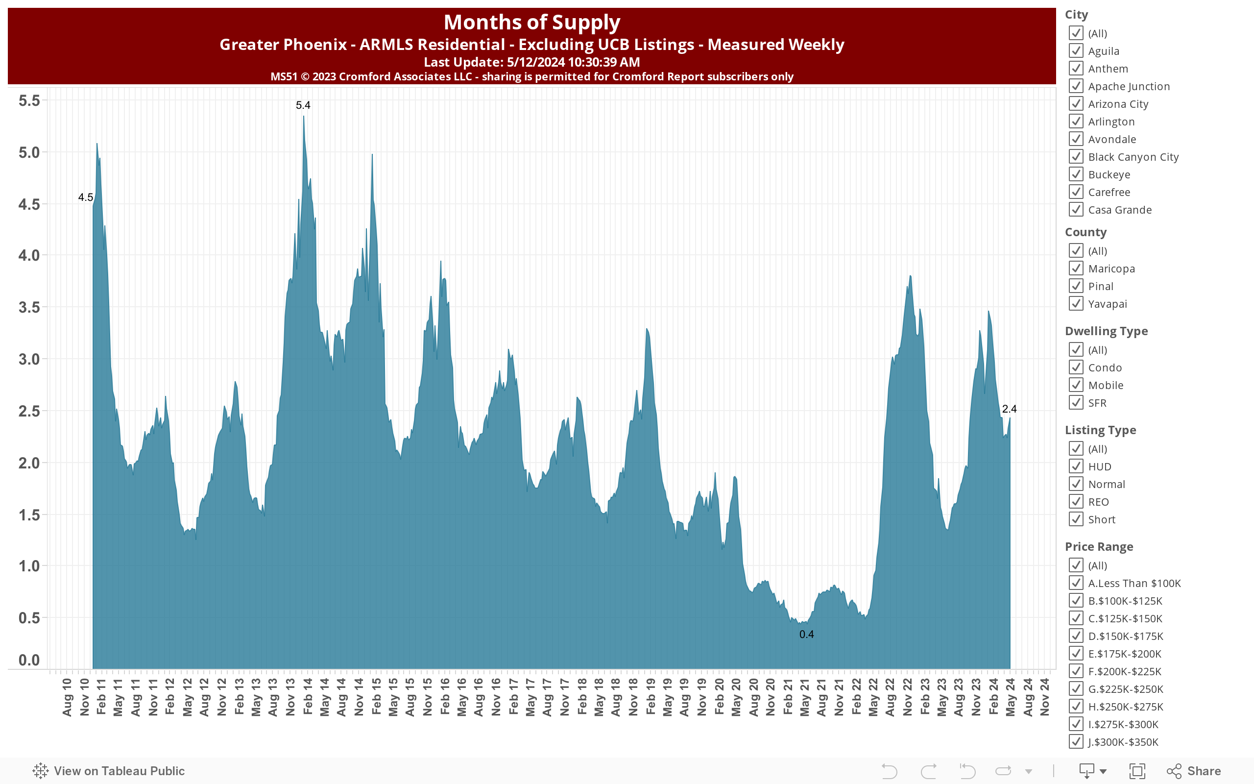
The chart above plots months of supply based on the monthly sales rate. It is based on all ARMLS residential sales within Greater Phoenix (i.e. it excludes out of area listings). You can select which cities should be included, which dwelling types (single family, condo or mobile) and which transaction types (normal, REO, short, HUD). You can also select any combination of price ranges. Thus there are thousands of different combinations so you can create exactly the chart you want. In this version UCB listings are excluded from the active counts. Copyright for this chart is strictly reserved. If you are an active subscriber to the Cromford Report, you may share this chart with your client or link to it on your blog or web-site. It is NOT permitted for non-subscribers to share it with anyone in any medium.